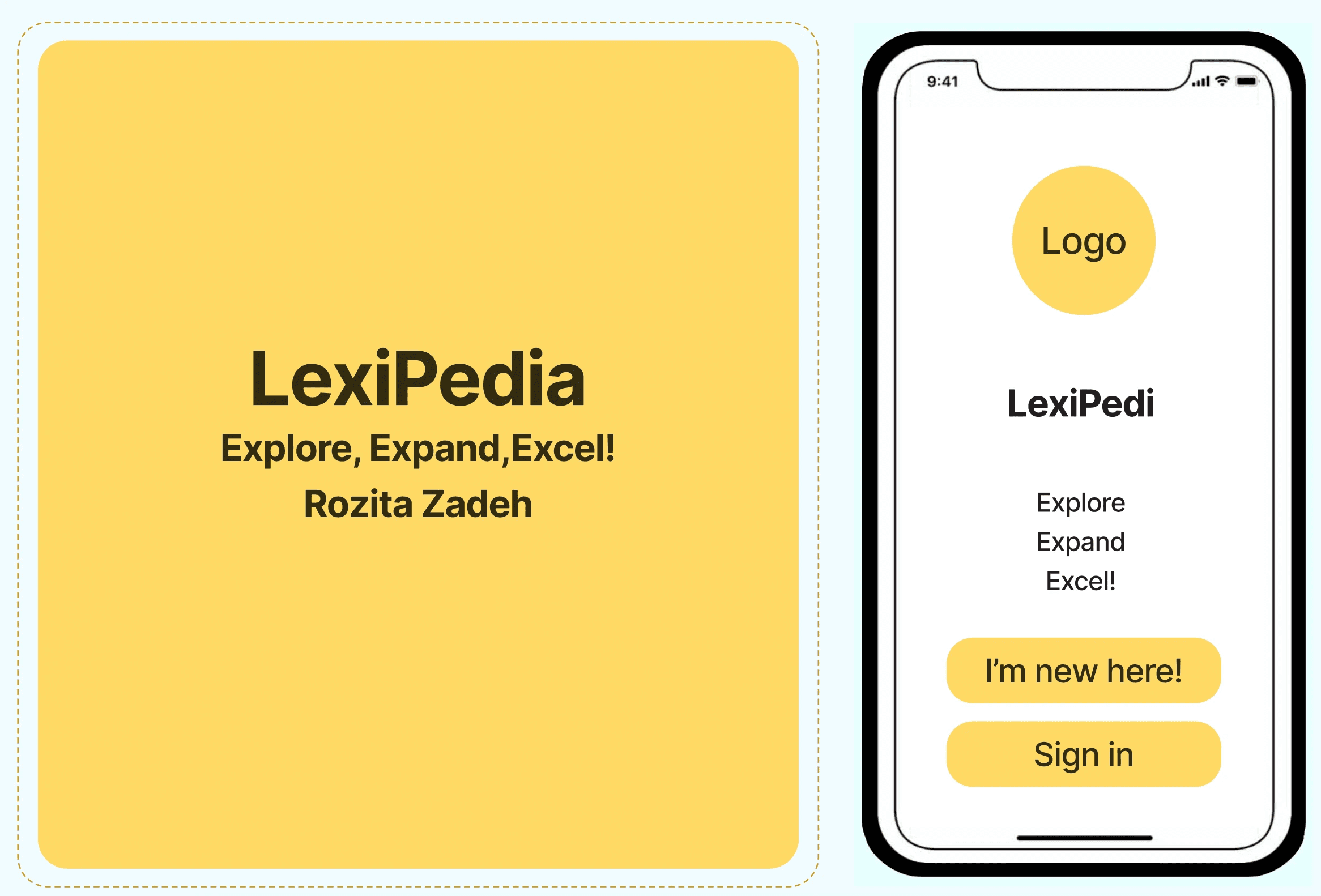
LexiPedia
Vocabulary Learning Made Simple
Career Foundry Case Study
By: Rozita Zadeh
LexiPedia
Vocabulary Learning Made Simple
Career Foundry Case Study
By: Rozita Zadeh
LexiPedia is a personalized vocabulary and pronunciation learning app designed to support bilingual users like immigrants, students, or professionals who want to expand their English fluency. This project was part of my CareerFoundry Product Design course and focused on designing an intuitive, supportive app that builds vocabulary, pronunciation, and confidence using clear UX principles.
Overview
LexiPedia is a personalized vocabulary and pronunciation learning app designed to support bilingual users like immigrants, students, or professionals who want to expand their English fluency. This project was part of my CareerFoundry Product Design course and focused on designing an intuitive, supportive app that builds vocabulary, pronunciation, and confidence using clear UX principles.
LexiPedia is a personalized vocabulary and pronunciation learning app designed to support bilingual users like immigrants, students, or professionals who want to expand their English fluency. This project was part of my CareerFoundry Product Design course and focused on designing an intuitive, supportive app that builds vocabulary, pronunciation, and confidence using clear UX principles.
Problem Statement
Many language learners—especially immigrants balancing work, school, and social lives—struggle to stay consistent with vocabulary learning. Through user interviews, I learned that they often feel frustrated trying to memorize and pronounce new words, especially when they don't have time to complete long lessons or navigate complex apps.
Sally, my proto-persona, is a 38-year-old immigrant from Mexico, working in retail and studying part-time. She wants to grow her vocabulary to connect better with her new community and advance her career, but lacks tools that are simple, engaging, and culturally sensitive.
Many language learners, especially immigrants balancing work, school, and social lives—struggle to stay consistent with vocabulary learning. Through user interviews, I learned that they often feel frustrated trying to memorize and pronounce new words, especially when they don't have time to complete long lessons or navigate complex apps.
Sally, my proto-persona, is a 38-year-old immigrant from Mexico, working in retail and studying part-time. She wants to grow her vocabulary to connect better with her new community and advance her career, but lacks tools that are simple, engaging, and culturally sensitive.
Many language learners—especially immigrants balancing work, school, and social lives—struggle to stay consistent with vocabulary learning. Through user interviews, I learned that they often feel frustrated trying to memorize and pronounce new words, especially when they don't have time to complete long lessons or navigate complex apps.
Sally, my proto-persona, is a 38-year-old immigrant from Mexico, working in retail and studying part-time. She wants to grow her vocabulary to connect better with her new community and advance her career, but lacks tools that are simple, engaging, and culturally sensitive.
LexiPedia is a personalized vocabulary and pronunciation learning app designed to support bilingual users like immigrants, students, or professionals who want to expand their English fluency. This project was part of my CareerFoundry Product Design course and focused on designing an intuitive, supportive app that builds vocabulary, pronunciation, and confidence using clear UX principles.
If users are given an intuitive app that includes search-based learning, pronunciation help, and personalized note-taking features, they will be more likely to stay consistent with their vocabulary practice and improve their fluency over time.
If users are given an intuitive app that includes search-based learning, pronunciation help, and personalized note-taking features, they will be more likely to stay consistent with their vocabulary practice and improve their fluency over time.
I conducted 4 user interviews and gathered feedback through usability testing sessions
(2 in person, 2 remote). I also studied apps like Quizlet, Brainscape, and AnkiApp, identifying key gaps:
Too much emphasis on memorization over context.
Frustration with complicated sign-up processes.
Lack of speech features or personal note options.
Key Research Takeaways
(Doing/Thinking/Feeling):
Users connect better with vocabulary when it’s tied to real life (projects, conversations, travels).
They appreciate repetition, pictures, and hearing pronunciation.
They dislike being asked to give too much personal data upfront.
Many want flexibility: voice, text, or image search depending on the moment.
Wireframing & Prototyping
Wireframing & Prototyping
Wireframing & Prototyping
User Stories & Job Stories
"As Sally, I want to boost my English vocabulary to excel in my career."
"When I encounter unfamiliar words, I want to learn pronunciation and meaning so I can use them in real conversations."
User Flow & Sitemap
I mapped out a simplified user journey—from opening the app to saving a word and adding a note. Key flows included:
Search (by voice, text, or image)
Save to folder
Add personalized notes
Use AI (LexiChat) for help
View progress with Insights
Wireframes & Prototyping
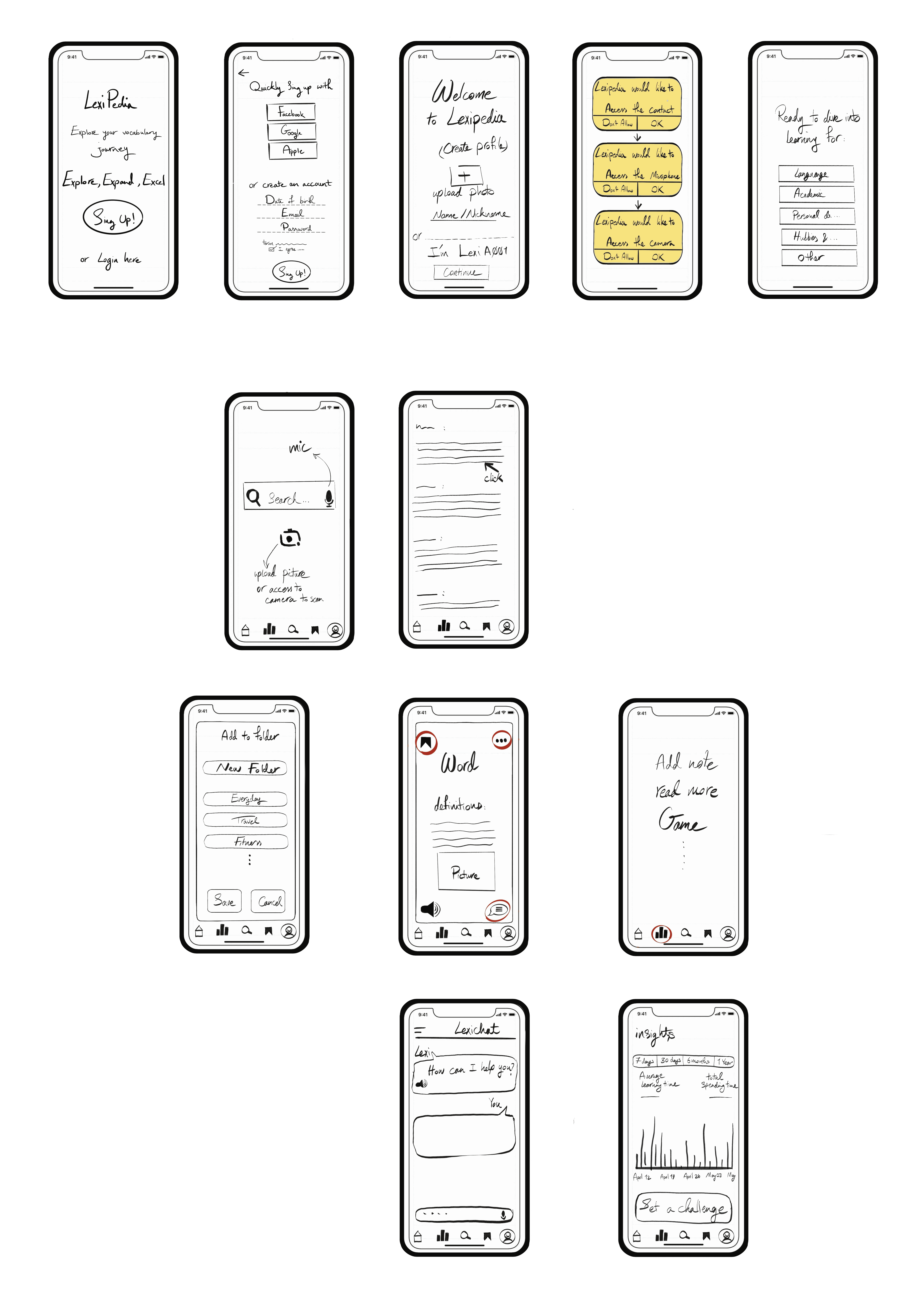
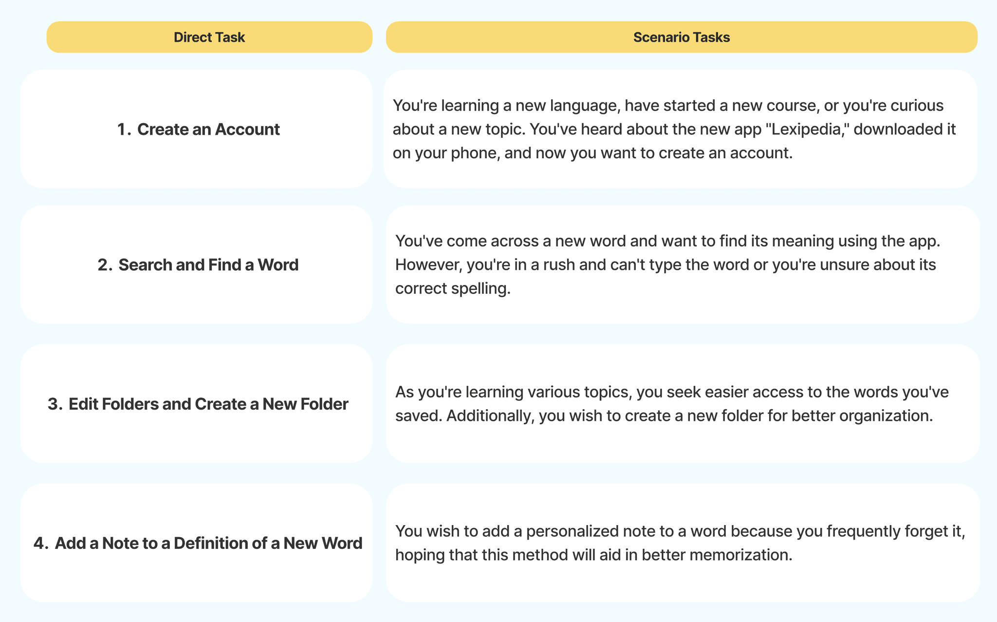
I created low-fidelity wireframes by hand to visualize each screen. Then I prototyped the core user flows using Figma, testing four tasks:
Create an account
Search and find a word
Edit folders / create a new folder
Add a note to a word
User Stories & Job Stories
"As Sally, I want to boost my English vocabulary to excel in my career."
"When I encounter unfamiliar words, I want to learn pronunciation and meaning so I can use them in real conversations."
User Flow & Sitemap
I mapped out a simplified user journey—from opening the app to saving a word and adding a note. Key flows included:
Search (by voice, text, or image)
Save to folder
Add personalized notes
Use AI (LexiChat) for help
View progress with Insights
Wireframes & Prototyping
I created low-fidelity wireframes by hand to visualize each screen. Then I prototyped the core user flows using Figma, testing four tasks:
Create an account
Search and find a word
Edit folders / create a new folder
Add a note to a word
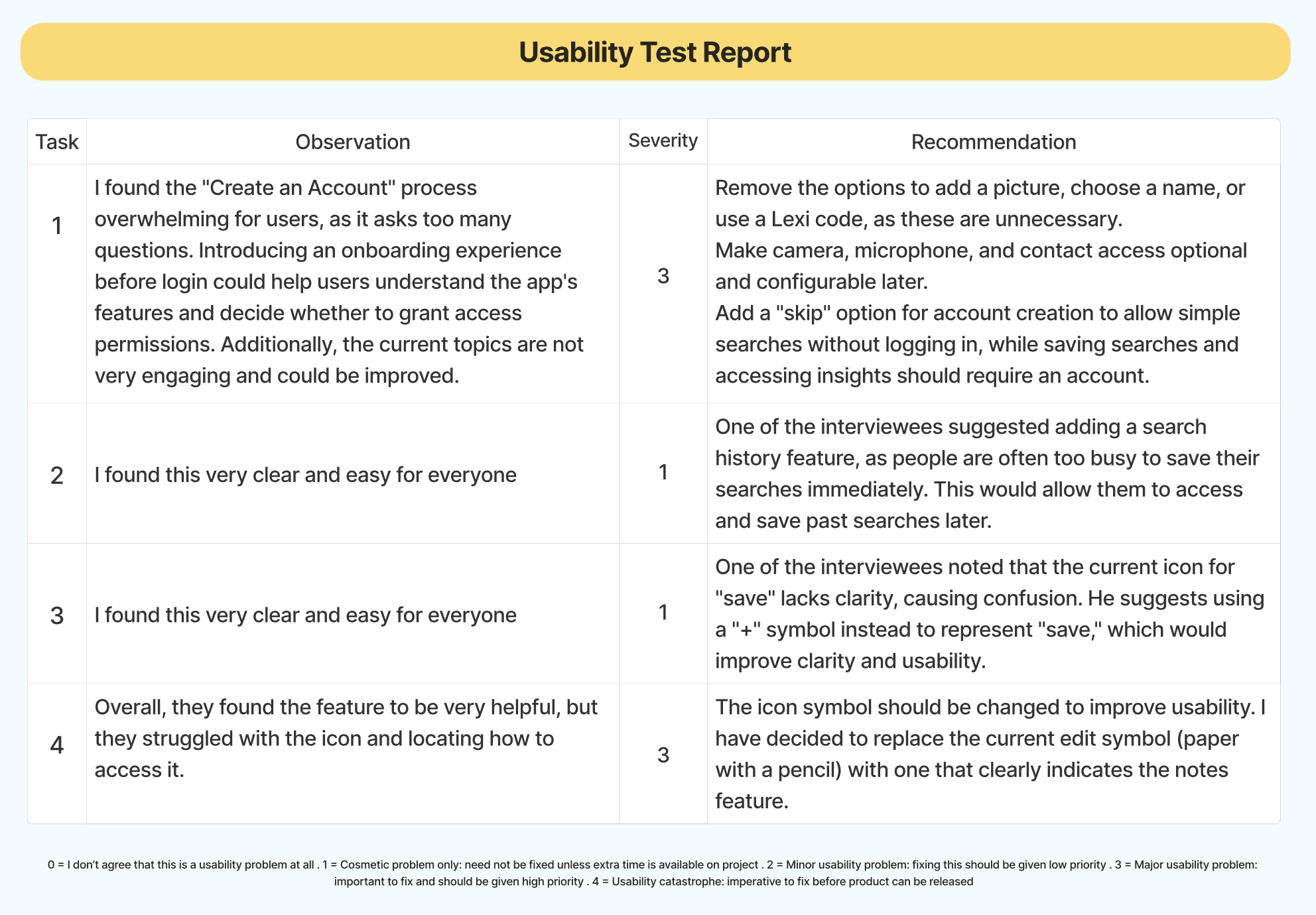
Usability Testing
Each session lasted ~15 minutes. I asked users to think aloud while completing the tasks.
Key Findings:
TaskIssueSeverityFixCreate AccountToo many personal questions upfront3 (Major)Add “skip for now”; make permissions optionalAdd NoteIcon not clear3 (Major)Replace unclear icon with pencil symbolSearchSmooth and clear1 (Minor)Add search history for convenienceSave WordClear for most, some confusion1 (Minor)Replace “save” icon with "+" symbol for better clarity
Sample Feedback:
“Why does it ask for photo and nickname before I even try it?”
“I love the mic option—makes searching faster.”
“I couldn’t tell that icon meant notes—I’d miss it!”
Reflection
Designing LexiPedia helped me grow as a product designer by showing how even small barriers—like a confusing icon or long sign-up form—can create major friction for users. Listening to real feedback was key. I learned to:
Prioritize simplicity and flexibility
Test early and often
Design for real-life use, not assumptions
This case study not only improved my UX skills, but reminded me why I love designing inclusive tools that help people thrive.
Next Iterations
Based on testing, I planned several improvements:
Onboarding:
Add a short welcome screen explaining app features
Let users skip sign-up and start searching immediately
Notes Feature:
Use a pencil icon
Include notes in the bottom navigation or a "+" menu
Fun Additions:
Explore a mini word challenge or game on the homepage
Navigation:
Clarify icon meaning with hover text or brief tooltips
Permissions:
Move camera/mic requests to the search bar contextually
Outcome
Through user-centered design and real testing, I built a vocabulary app prototype that’s flexible, inclusive, and easy to use. The final result is a more thoughtful, intuitive learning experience with:
Personalized folders
Note-taking and AI support
Voice/image/text search
Simple onboarding and privacy options
Each session lasted ~15 minutes. I asked users to think aloud while completing the tasks.
Key Findings:
TaskIssueSeverityFixCreate AccountToo many personal questions upfront3 (Major)Add “skip for now”; make permissions optionalAdd NoteIcon not clear3 (Major)Replace unclear icon with pencil symbolSearchSmooth and clear1 (Minor)Add search history for convenienceSave WordClear for most, some confusion1 (Minor)Replace “save” icon with "+" symbol for better clarity
Sample Feedback:
“Why does it ask for photo and nickname before I even try it?”
“I love the mic option—makes searching faster.”
“I couldn’t tell that icon meant notes—I’d miss it!”
Based on testing, I planned several improvements:
Onboarding:
Add a short welcome screen explaining app features
Let users skip sign-up and start searching immediately
Notes Feature:
Use a pencil icon
Include notes in the bottom navigation or a "+" menu
Fun Additions:
Explore a mini word challenge or game on the homepage
Navigation:
Clarify icon meaning with hover text or brief tooltips
Permissions:
Move camera/mic requests to the search bar contextually
Through user-centered design and real testing, I built a vocabulary app prototype that’s flexible, inclusive, and easy to use. The final result is a more thoughtful, intuitive learning experience with:
Personalized folders
Note-taking and AI support
Voice/image/text search
Simple onboarding and privacy options
Designing LexiPedia helped me grow as a product designer by showing how even small barriers—like a confusing icon or long sign-up form—can create major friction for users. Listening to real feedback was key. I learned to:
Prioritize simplicity and flexibility
Test early and often
Design for real-life use, not assumptions
This case study not only improved my UX skills, but reminded me why I love designing inclusive tools that help people thrive.